Images
Images can be responsive to fit the parent's width, and also can be customised to be round shaped
You can add .img-responsive to make your image fit with container .img-responsive uses width:100%, height:auto.
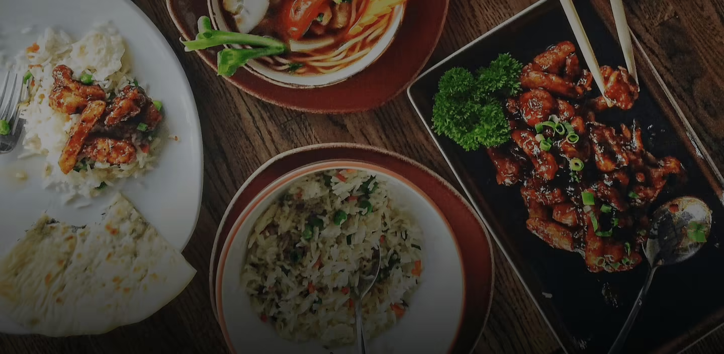
Example of Responsive Image Banner
Round & Squared Images
To make images round shape use .img-round and square shape use .img-square followed by sizes .img-lg, .img-md, .img-sm